Color contrast: why 4.5:1 is the number to hit
Whether text is readable is not a matter of taste. It is a number, and 4.5:1 is the pass mark.
Someone once told me my gray text was invisible. I looked at my screen again. It looked fine.
On a large monitor, in a bright room, with eyes that had been staring at that color for three hours.
It's measured with a single number
The difference between your text color and your background color comes out as one number. Higher is more readable.
- Black on white = 21 (the highest there is)
- White on white = 1 (the lowest, nothing visible)
Two thresholds are all you need.
| Text | Must clear |
|---|---|
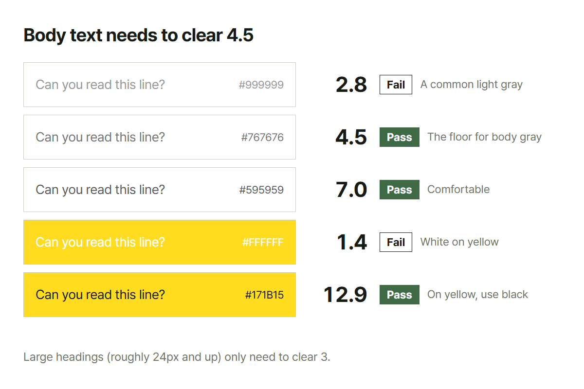
| Body text and anything small | 4.5 |
| Large text, roughly 24px and up | 3 |
If you want margin, clear 7. That covers people reading on a phone outdoors and people whose eyesight isn't what it was.
Colors that fail often
| Combination | Value | |
|---|---|---|
White background + #999999 gray | 2.8 | Fails. Extremely common and nowhere near the mark |
White background + #767676 gray | 4.5 | Exactly on the line. This is the floor for body gray |
White background + #595959 gray | 7.0 | Comfortable |
| Yellow background + white text | 1.1–1.5 | Effectively invisible. Black goes on yellow |
| Blue background + black text | 2–3 | The darker the blue, the worse |
Why pale gray became fashionable
Because it looks refined on screen, and it's a convenient way to build hierarchy: important things dark, less important things faint.
The problem is that it only looks refined under the conditions of the person who made it. Step outside a bright office and a good monitor and things change.
- In sunlight on a phone, pale gray disappears
- Eyes take in less light as they age, so the same screen reads darker
- Cheap monitors have a narrower range and mush pale grays together
"Less important, so lighter" is the right instinct. But you can also make it smaller, or give it space. Lightness is not the only way to build a hierarchy.
Color blindness lands in the same place
Around 8% of men have difficulty distinguishing colors: one in twelve.
What matters here is that a difference in lightness survives regardless of hue. Someone who cannot tell red from green can still tell them apart if their lightness differs. So keeping an eye on the contrast number solves a good part of this too.
The converse: never make color the only signal. "The red rows are the errors" carries no information at all for some readers. Put a word or an icon alongside the color.
What this does not cover
- Colors with transparency: text over a translucent layer takes its real color from whatever is
behind it, so measure the final composited color
- Text on a gradient: the value differs across it, so measure at the worst point
- Text over an image: usually you lay a dark scrim underneath and measure against that
Two colors go in, text and background, and the ratio comes back with a pass or fail beside it. Hex (#333333) and RGB convert between each other.
Chrome and Edge will also let you pick a color from anywhere on screen. Firefox and Safari have not implemented that, so the button sits grayed out in those two.